IBM Had 77,000 Reports for Sales Forecasting
Dreamforce
The short answer. An IBM speaker said in the Dreamforce 2026 Tableau keynote that the company had about 77,000 reports used for sales forecasting, and consolidated them to roughly 100 core Salesforce dashboards. Report sprawl on that scale happens because building a new report is easier than finding and trusting an existing one.

One number from Dreamforce 2026 has stayed with us more than any announcement. It came from an IBM speaker in the Tableau keynote, said almost in passing:
Before going on to Sales Cloud and CRMA, we had about 77,000 reports that were used for sales forecasting. We were able to get that down to about 100 core dashboards.
Source: Tableau Keynote: Beyond BI, Welcome to Agentic Analytics, Dreamforce 2026
Seventy-seven thousand reports. For one job. Forecasting.
Your org has a smaller version of that number, and you probably know roughly what it is. The reason it exists is not incompetence, and that is the interesting part.
Why report sprawl happens, mechanically
Report sprawl is a rational response to two costs. Finding an existing report that does what you want costs more than making a new one. And trusting a report somebody else made costs more than trusting one you made yourself.
When both of those are true, every person who needs an answer creates an artifact. Do that for a decade across a large company and you get five figures.
A CrowdStrike speaker in the same keynote described the downstream symptom precisely:
Everyone comes into the meeting and everyone has their own data and none of it aligns, and we waste 20 minutes going through that.
Source: Tableau Keynote: Beyond BI, Welcome to Agentic Analytics, Dreamforce 2026
Twenty minutes of every meeting, reconciling. Multiply by the meetings.
The second number, which is the more useful one
The same IBM speaker gave a figure that explains more about analytics adoption than most research does:
Not all of our employees get licensed to Sales Cloud or Service Cloud that need to be involved in closing a case or closing a deal. So we have about 68,000 CRMA users, but we have about 280,000 employees.
Source: Tableau Keynote: Beyond BI, Welcome to Agentic Analytics, Dreamforce 2026
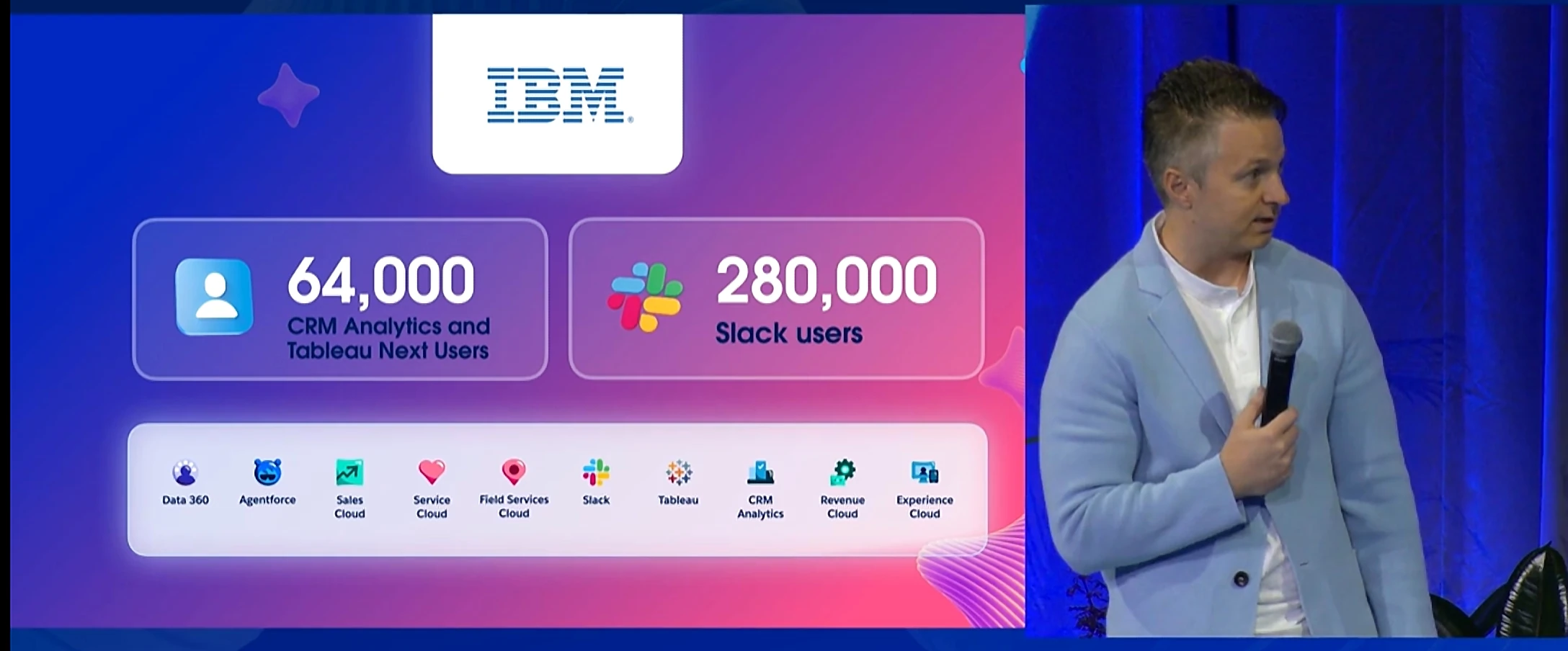
Roughly a quarter of the company can see the analytics, and the other three quarters include people who are involved in closing the deal. Those people get their numbers from somebody who exports them.
This is where the shadow spreadsheet is born, and it comes from how the licenses are distributed, not from how people behave.
The diagnosis from Mastercard
This is the line we keep quoting from that keynote, because it names the real constraint:
And if you guys are sitting on a rich CRM and BI data and your dashboard adoption is low, you have the same exact problem as we did. The data is not the bottleneck, the interface is.
Source: Tableau Keynote: Beyond BI, Welcome to Agentic Analytics, Dreamforce 2026
The Dreamforce answer to that, and it is a good one, is conversational: stop making people navigate to analytics, and bring the analytics to them in Slack, in the CRM, wherever they are.

What consolidation does not fix
Going from 77,000 reports to 100 Salesforce dashboards is a real achievement, and we do not want to undersell it. But notice what it solves and what it does not.
It solves disagreement about the number. One hundred governed dashboards means the forecast is the forecast.
It does not solve what happens after somebody looks at the dashboard and sees something wrong. That person still has to go and fix records, and the path from the governed dashboard to the records is an export, a report, or a lot of clicking.
That is how you get report 77,001. Not because the hundred dashboards are bad, but because somebody needed the rows and the dashboard would not give them up.
A different way to count success
If we were measuring an analytics consolidation, we would track the number of reports, because that is the obvious one. But we would also track two others:
- Exports per week, and who does them. An export is a vote that the tool did not finish the job.
- Time from spotting a wrong number to the record being corrected. If that is measured in days, the consolidation did not reach the work.
When the export count falls, that is the proof that the time to fix got shorter.
Where we come into this
Disclosure: we sell the thing we are about to describe, so weigh this section accordingly.
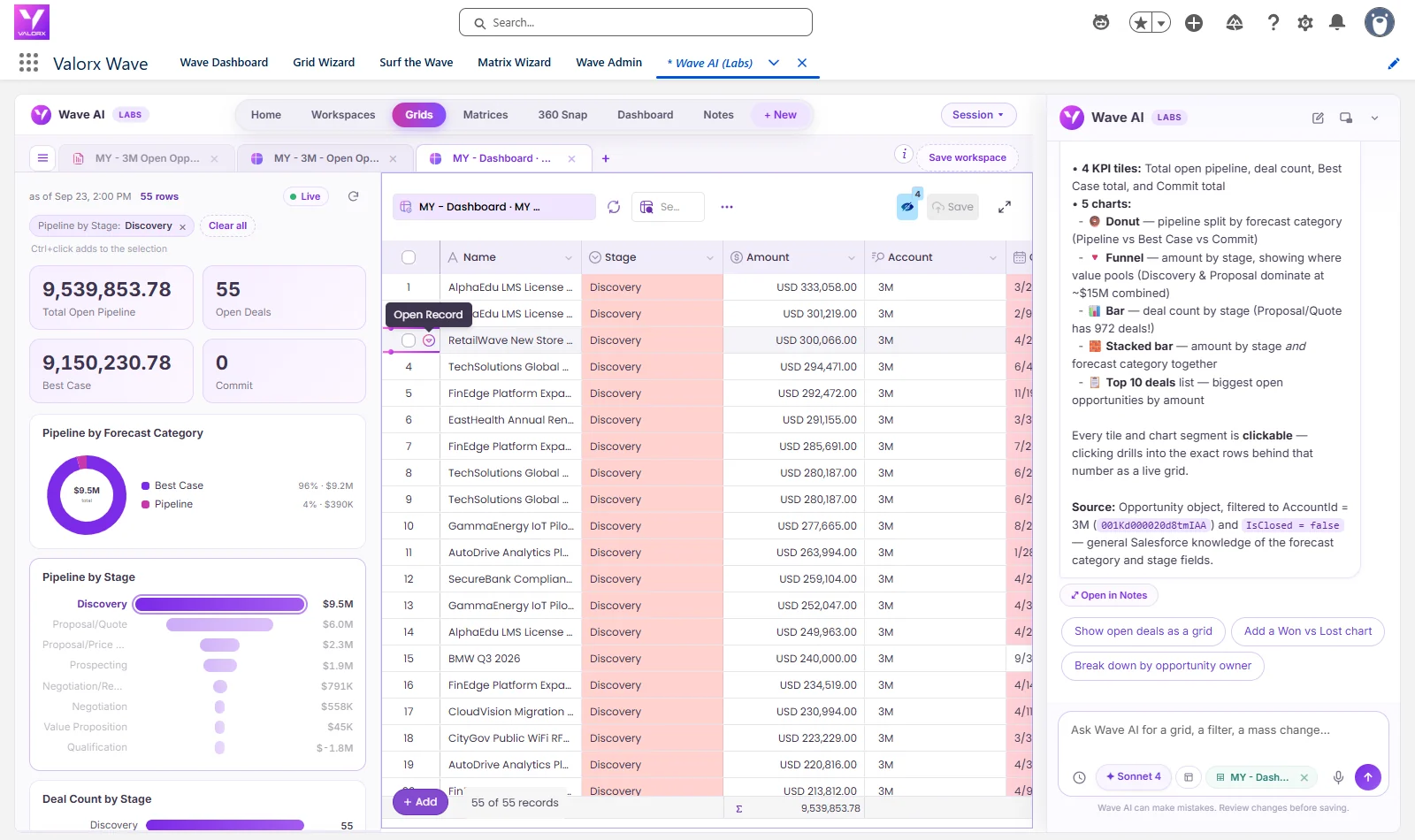
Valorx Wave closes the last gap rather than the first. Ask Wave AI for the records behind the number, and it opens them in a grid you can edit inside Salesforce. Fix the ones that are wrong, review the changes, save.
That does not reduce your report count. It removes the reason somebody creates the next one.
Frequently asked questions
How many reports is too many in Salesforce?
There is no absolute number, but sprawl is diagnosable. If people build new reports rather than searching for existing ones, and meetings start with reconciling figures, the count is already past useful.
Why is Salesforce dashboard adoption low?
Often because the interface, not the data, is the constraint. A Mastercard speaker at Dreamforce 2026 said the data is not the bottleneck, the interface is. Licensing also matters, since many employees involved in closing deals may not have analytics access.
How do you reduce report sprawl?
Consolidating to a governed core of Salesforce dashboards is the standard answer, and it works for agreeing on the number. It does not remove the reason people create reports, which is usually needing the underlying rows in order to change something.
Sources
Quotes are verbatim from the session captions, with punctuation and capitalization added for readability, and link to the Salesforce+ recording. Captions carry no speaker labels, so speakers are identified only by the company named in the session. The 77,000 figure and the 68,000 of 280,000 figure are as stated by an IBM speaker; no supporting detail was given on stage.
- Tableau Keynote: Beyond BI, Welcome to Agentic Analytics, Dreamforce 2026, Salesforce+
.svg)





Choose the workflow you need:
Try Wave in browser Extension

Try Wave in Salesforce

Try Fusion In Excel

Enhancing Salesforce for industry leaders