Salesforce Reporting

Analyze your data and fix it in the same view. With pivot-table power and inline editing that Salesforce reports don't offer.
Excel spreadsheet showing a Salesforce Reporting Dashboard powered by Valorx Fusion with data on total reports, active users, data issues found, records fixed, and exports eliminated, plus tables listing reports by type and top data issues detected with priorities and last detected dates.
Reporting
USE CASES

What your Salesforce reporting has been missing

Stop exporting data just to analyze it. Stop finding problems you can't fix.
Excel-based Salesforce CPQ Quote Line Editor spreadsheet showing product codes, descriptions, quantities, pricing, discounts, net prices, and totals with a quote total of over $3.4 million.

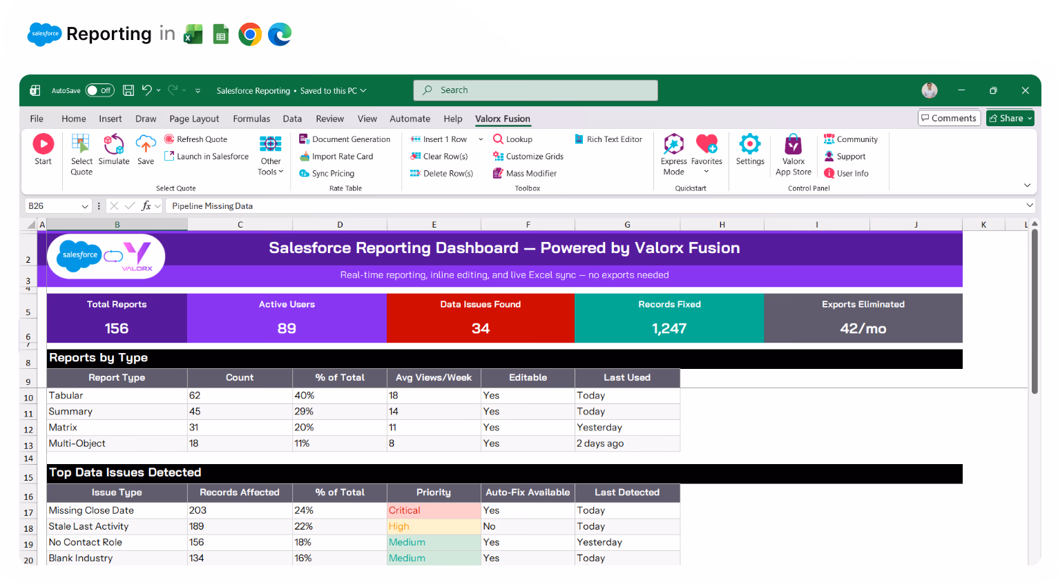
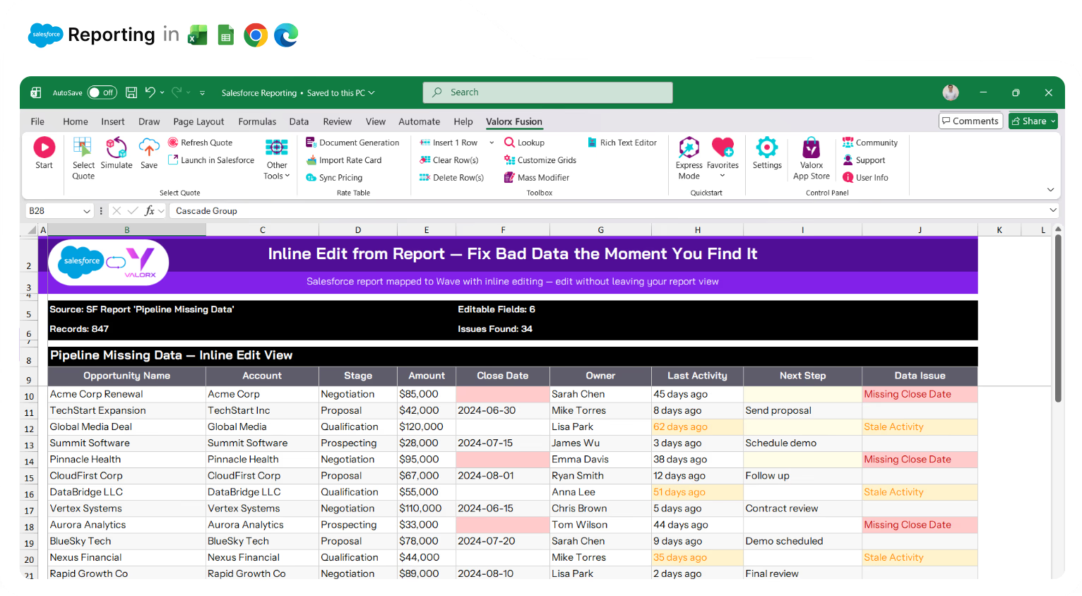
Fix bad data the moment you find it

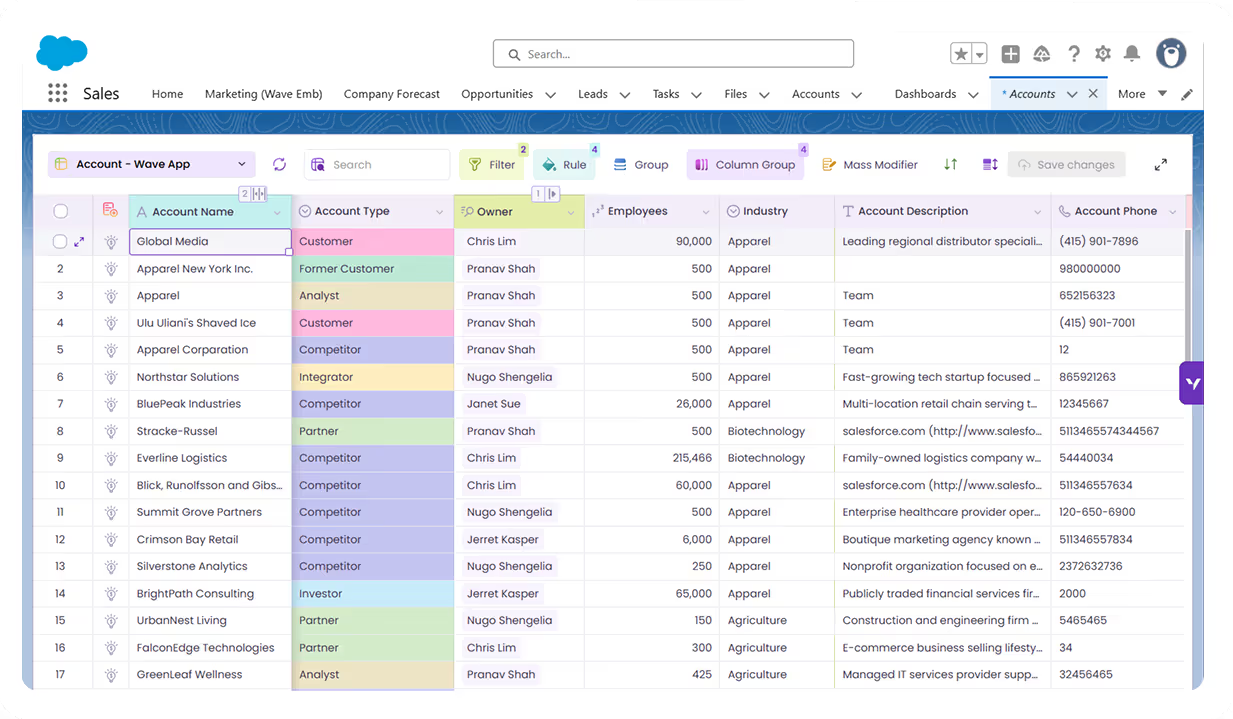
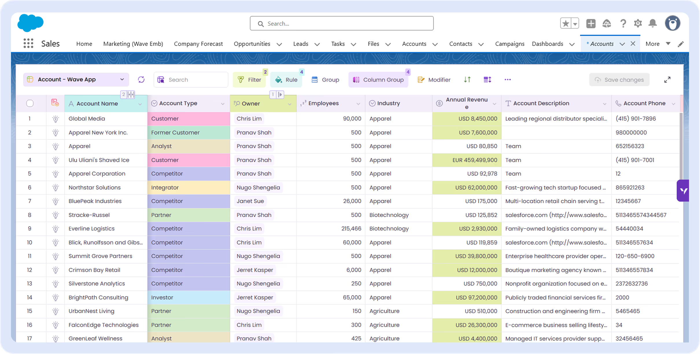
Salesforce reports show you problems but won't let you fix them. Map any report to an editable Wave grid—update records in place without drilling into each one.
Excel spreadsheet titled Pricing Management for Salesforce with product pricing details across multiple currencies including USD, AUD, EUR, GBP, and NZD, showing product names, codes, and pricing methods with some cells highlighted in green.

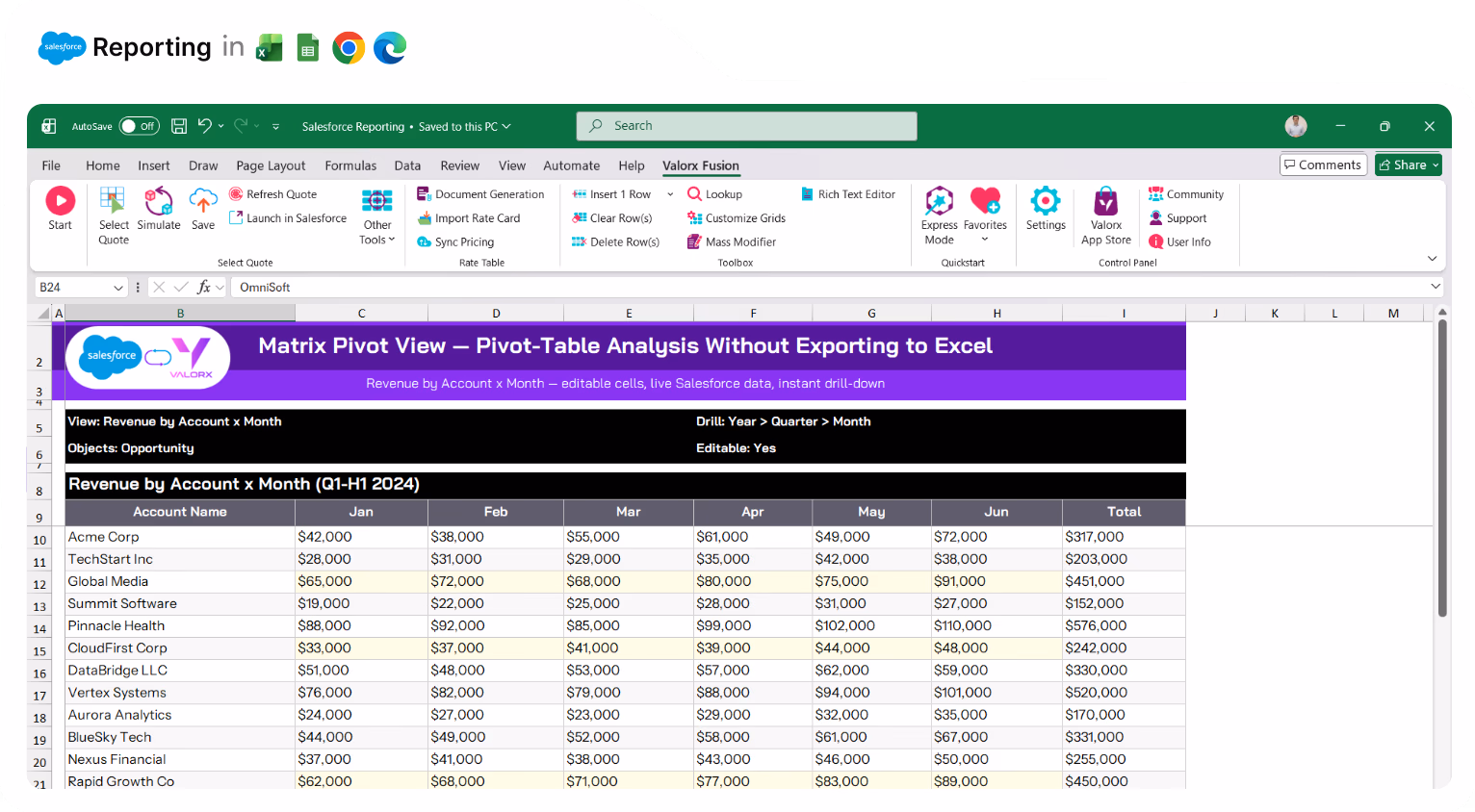
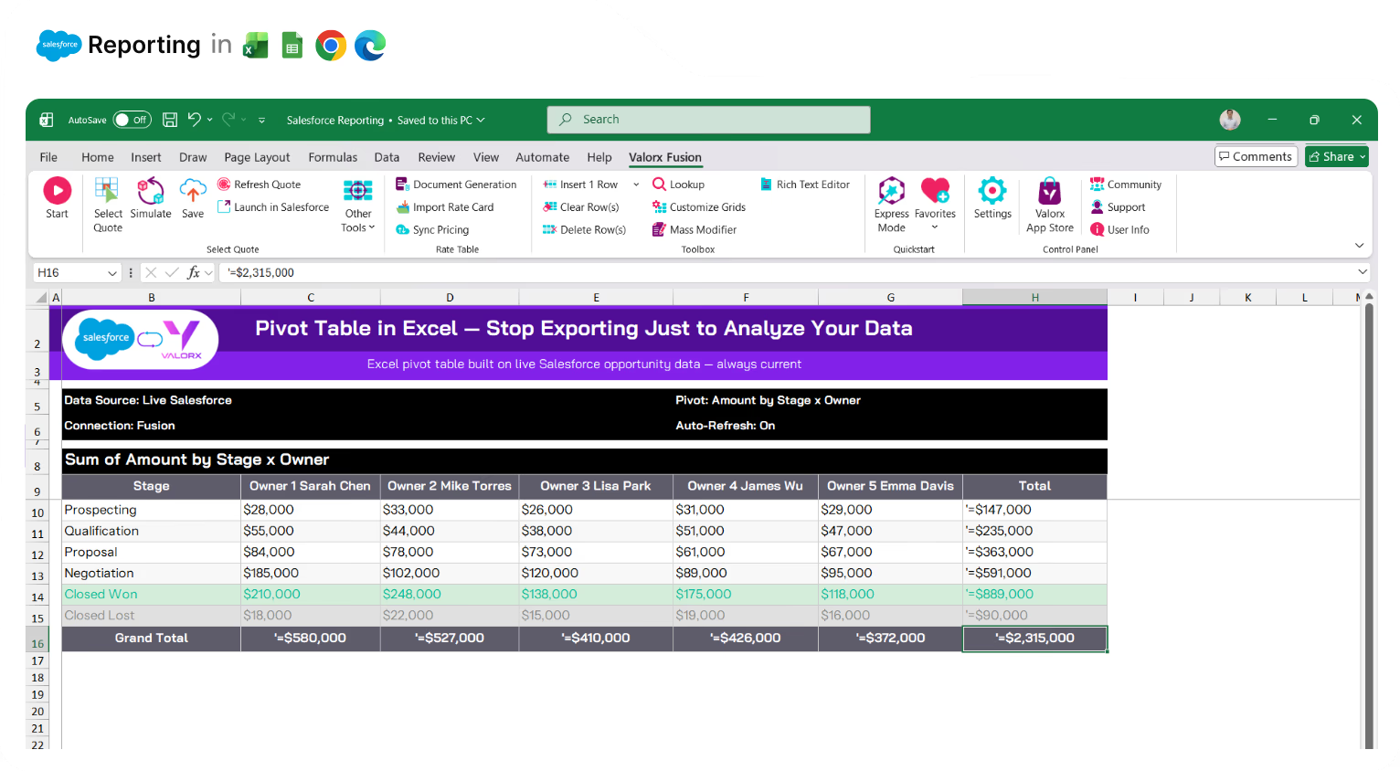
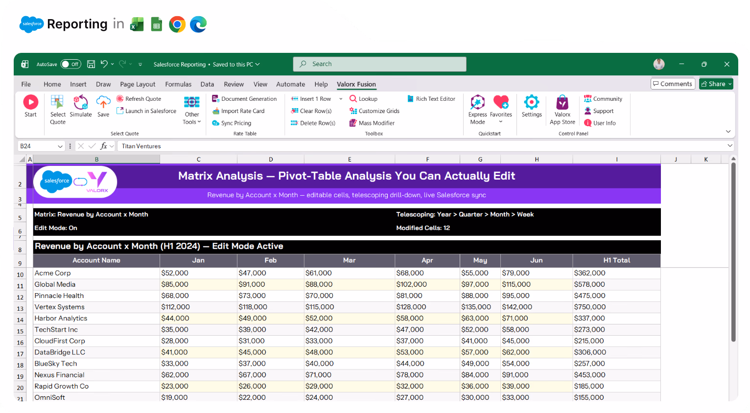
Pivot-table analysis without exporting to Excel

Salesforce matrix reports are read-only. Matrix gives you pivot-table views with dynamic groupings, drill-downs from year to quarter to month—and you can edit the underlying data. No more exporting just to slice your data differently.
Screenshot of Salesforce CPQ integration with Excel showing a Deal Pricing Estimator spreadsheet with sections for quote, partner, and account information, equipment summary, pricing details, and a bar chart of equipment summary.

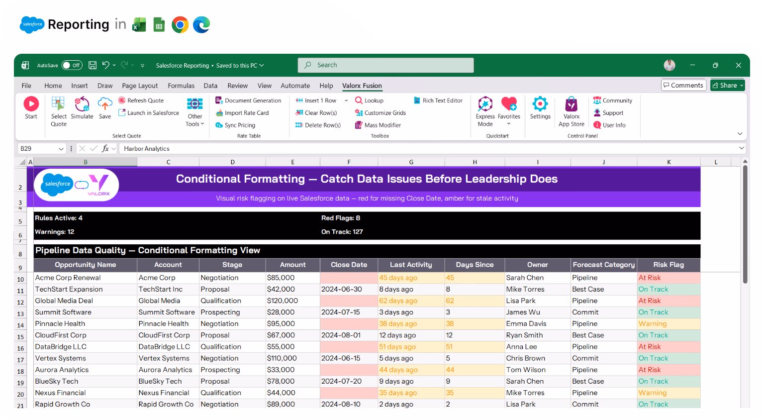
Catch data issues before leadership does

Conditional formatting highlights missing fields, overdue tasks, and at-risk deals automatically. Red for problems, yellow for warnings, green for on-track. See issues at a glance—before they show up in the board deck.
Excel spreadsheet showing Valorx Quote Line Editor with product list, quantities, unit prices, discounts, net prices, and totals for Bogan Inc.

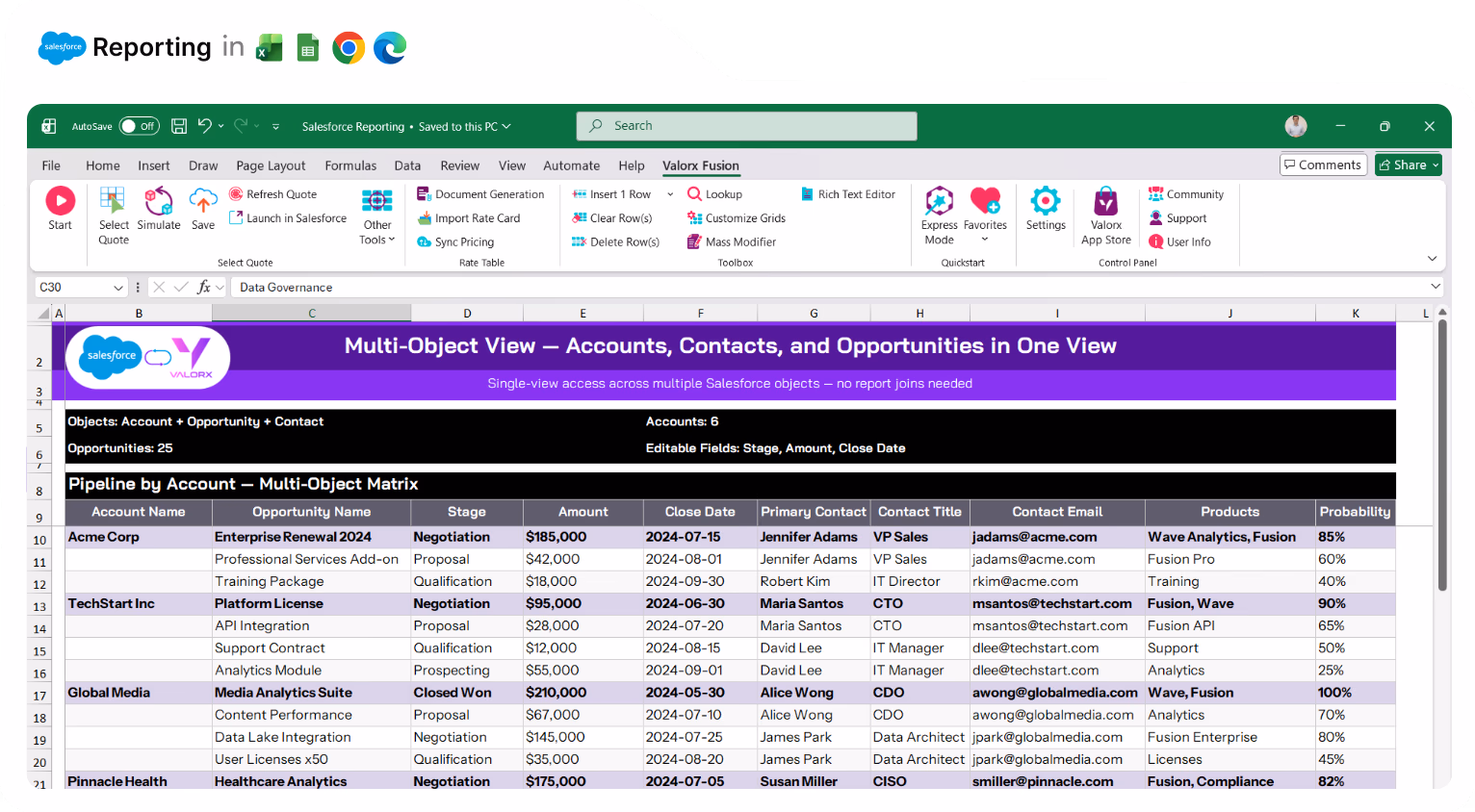
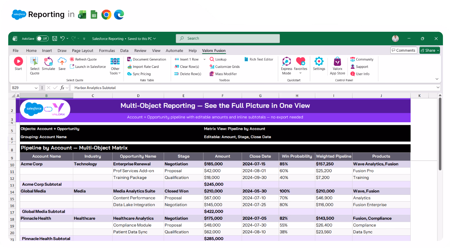
See Accounts, Contacts, and Opportunities in one view

Joined reports are clunky and limited. Matrix connects up to 3 Salesforce objects in a single editable grid. Pipeline by product and rep. Revenue by account and quarter. No tab-switching, no context lost.
Spreadsheet in Excel showing a table of accounts with columns for Account Name, Industry, Account Source, Account Type, and Account Owner, color-coded by industry, under the section titled ACCOUNTS with 975 total accounts.

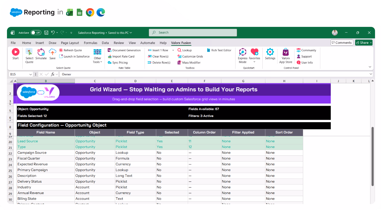
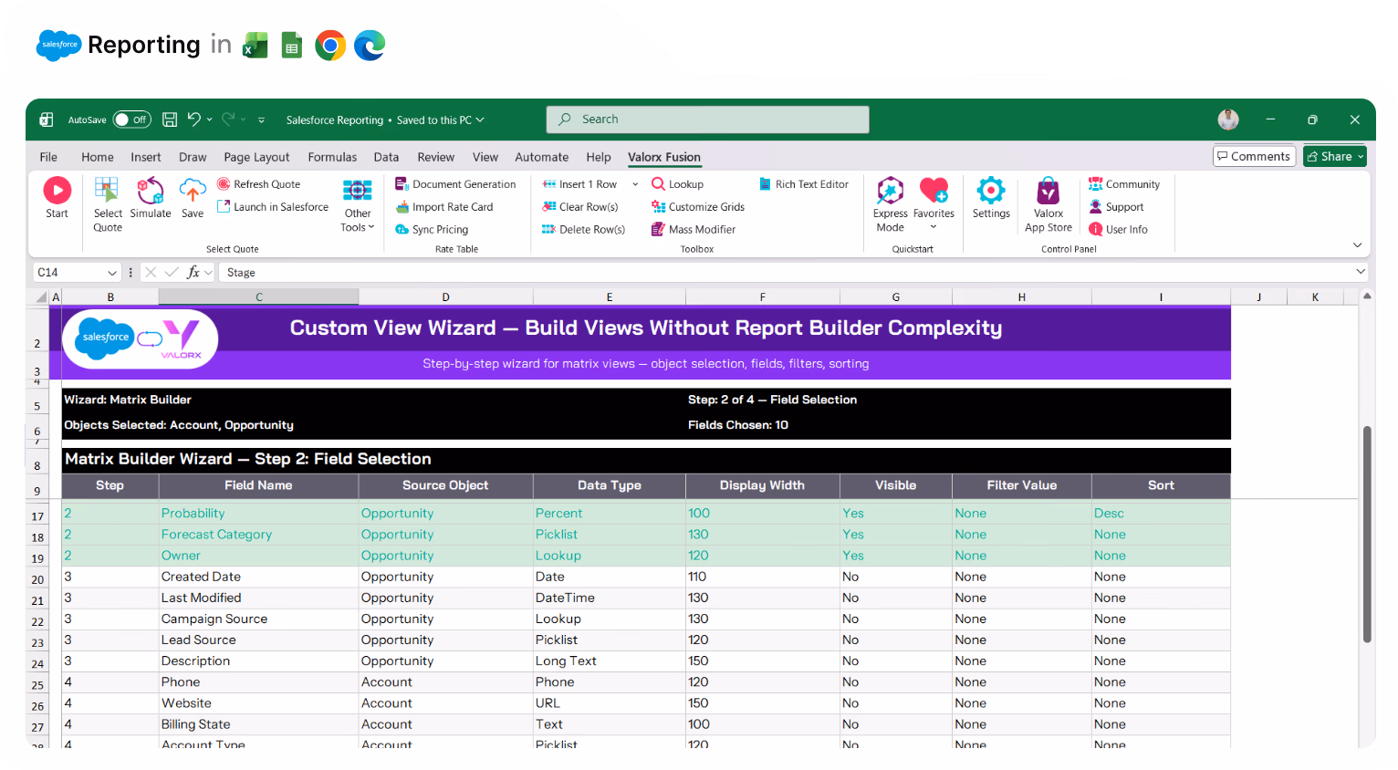
Stop waiting on admins to build your reports

Every custom report requires a ticket. Grid Wizard and Matrix Wizard are point-and-click—pick your objects, choose your fields, set your filters. Business users build what they need without waiting in the admin queue.
Spreadsheet in Excel showing a table of accounts with columns for Account Name, Industry, Account Source, Account Type, and Account Owner, color-coded by industry, under the section titled ACCOUNTS with 975 total accounts.

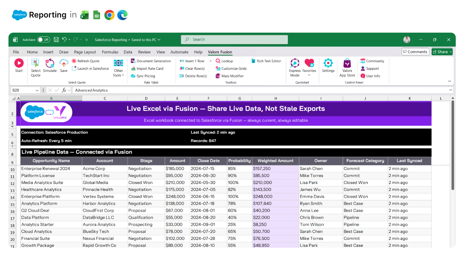
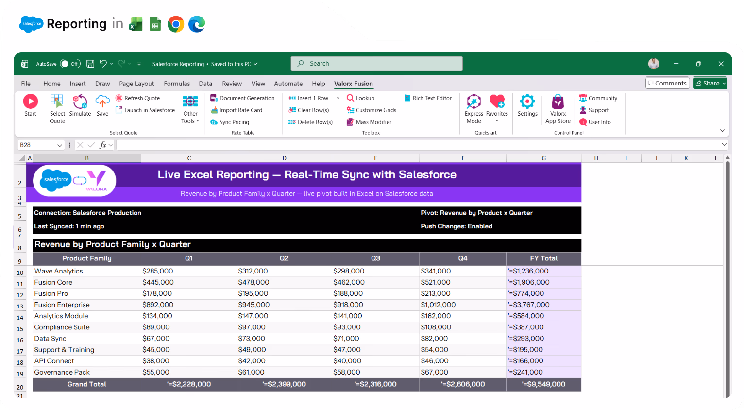
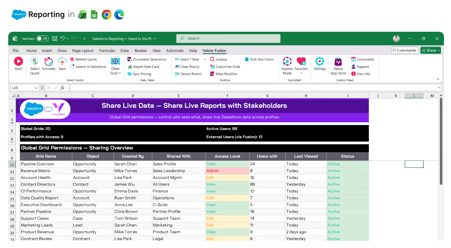
Share live data—not stale exports

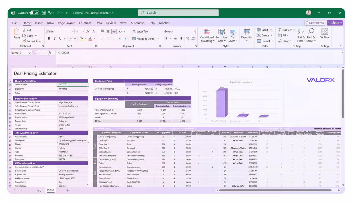
Leadership wants the numbers in Excel. So you export, format, email—and it's outdated by the time they open it. Fusion connects Excel to live Salesforce data. They get real-time numbers. You stop being the export button.
Spreadsheet in Excel showing a table of accounts with columns for Account Name, Industry, Account Source, Account Type, and Account Owner, color-coded by industry, under the section titled ACCOUNTS with 975 total accounts.

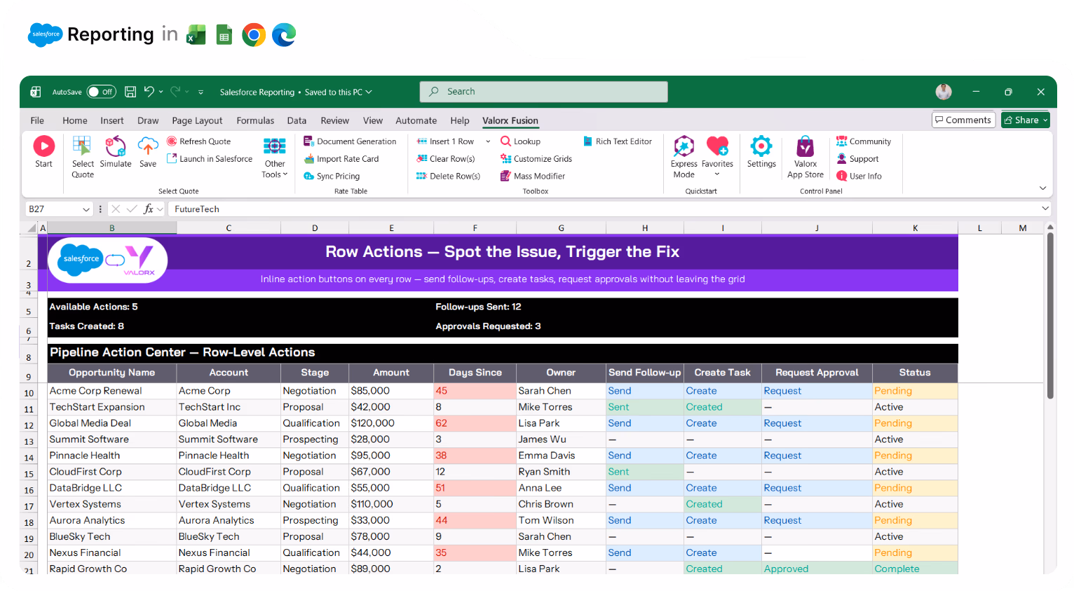
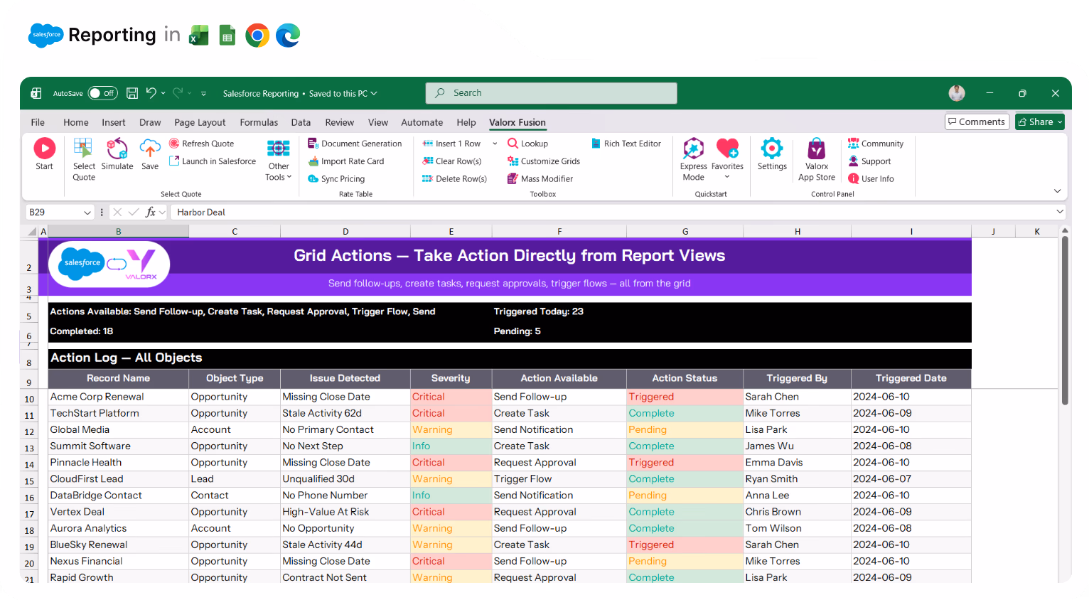
Spot the issue, trigger the fix

Reports show problems but can't do anything about them. Add Row Actions that trigger Flows, send follow-up emails, or create tasks—directly from the grid. Find the stale opportunity, click to send the nudge.
Spreadsheet in Excel showing a table of accounts with columns for Account Name, Industry, Account Source, Account Type, and Account Owner, color-coded by industry, under the section titled ACCOUNTS with 975 total accounts.

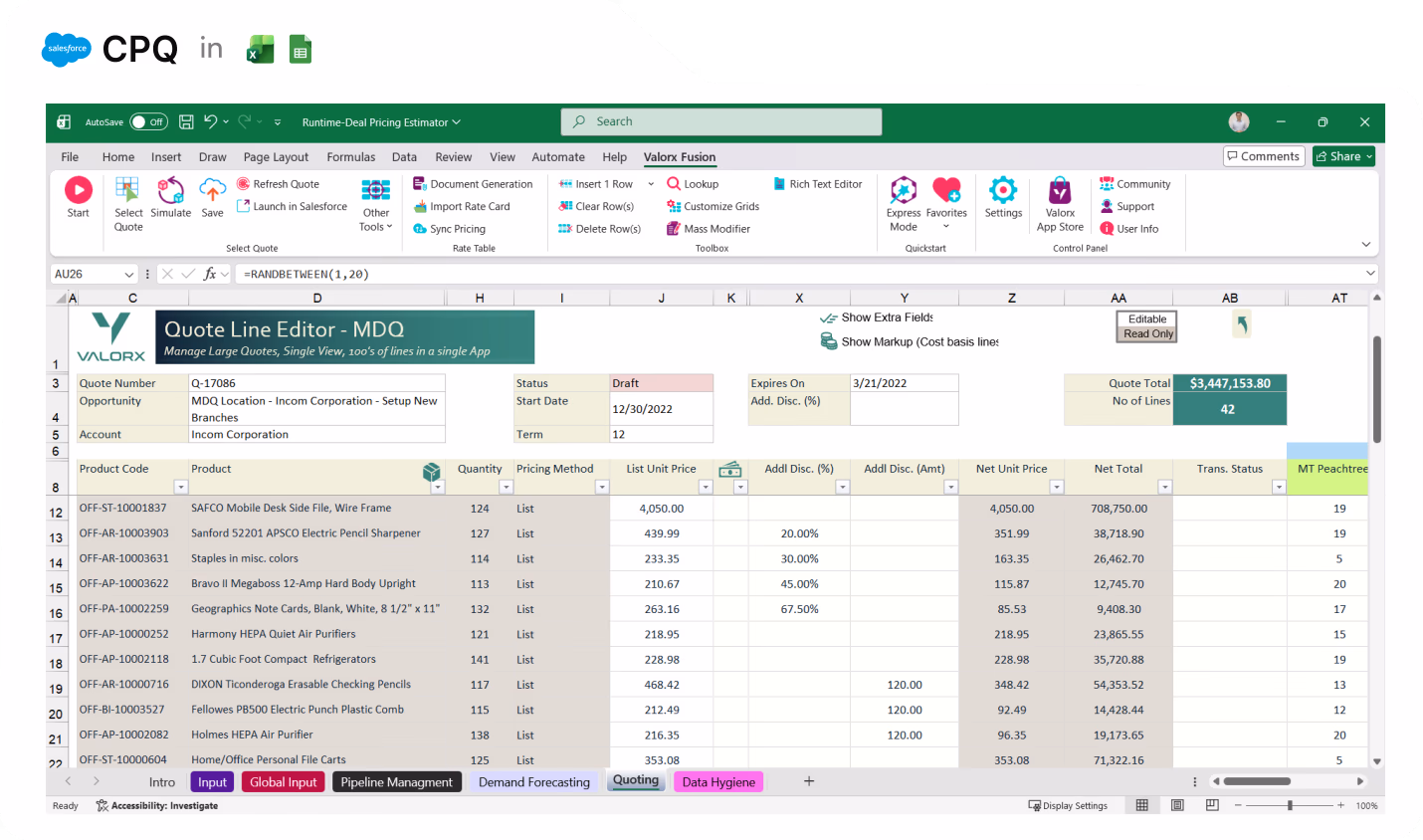
Stop exporting to Excel just to analyze your data

You export because Salesforce reports can't do what Excel can. Fusion gives you Excel's full power—formulas, pivot tables, charts—connected to live Salesforce data. Build the analysis you need without the export/import cycle.
Spreadsheet in Excel showing a table of accounts with columns for Account Name, Industry, Account Source, Account Type, and Account Owner, color-coded by industry, under the section titled ACCOUNTS with 975 total accounts.

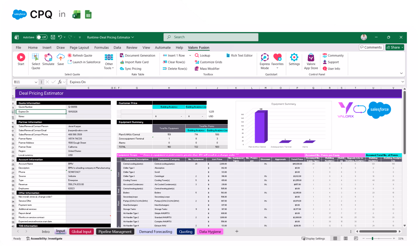
Multi-object reporting in one view

Matrix connects up to 3 Salesforce objects in a single grid. See pipeline by product and account, revenue by rep and quarter, cases by type and priority—all editable.
Spreadsheet in Excel showing a table of accounts with columns for Account Name, Industry, Account Source, Account Type, and Account Owner, color-coded by industry, under the section titled ACCOUNTS with 975 total accounts.

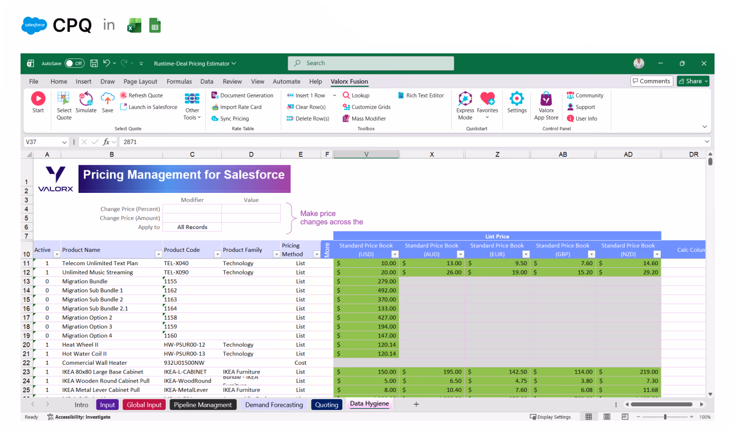
Live Excel reporting with real-time sync

Need Excel's formulas and pivot tables? Fusion connects your spreadsheet to live Salesforce data. Build reports with all of Excel's power—without exports that go stale.
Spreadsheet in Excel showing a table of accounts with columns for Account Name, Industry, Account Source, Account Type, and Account Owner, color-coded by industry, under the section titled ACCOUNTS with 975 total accounts.

Take action from report views

Add Row Actions and Grid Actions that trigger Flows, send emails, or create tasks. Spot the issue, fix the data, trigger the follow-up—all from the same view.
Spreadsheet in Excel showing a table of accounts with columns for Account Name, Industry, Account Source, Account Type, and Account Owner, color-coded by industry, under the section titled ACCOUNTS with 975 total accounts.

Edit records directly from reports

Map any Salesforce report to an editable Wave grid. Find problem records and fix them in place—no drilling into each one.
Spreadsheet in Excel showing a table of accounts with columns for Account Name, Industry, Account Source, Account Type, and Account Owner, color-coded by industry, under the section titled ACCOUNTS with 975 total accounts.

Pivot-table analysis you can actually edit

Matrix views work like Excel pivot tables—with dynamic groupings, summarization, and telescoping from years to quarters to months. Unlike Salesforce matrix reports, you can edit the underlying data.
Spreadsheet in Excel showing a table of accounts with columns for Account Name, Industry, Account Source, Account Type, and Account Owner, color-coded by industry, under the section titled ACCOUNTS with 975 total accounts.

Spot trends and outliers visually

Apply conditional formatting to highlight what matters—red for at-risk deals, yellow for missing fields, green for on-track accounts. See patterns Salesforce reports don't show.
Spreadsheet in Excel showing a table of accounts with columns for Account Name, Industry, Account Source, Account Type, and Account Owner, color-coded by industry, under the section titled ACCOUNTS with 975 total accounts.

Create custom views without report builder complexity

Grid Wizard and Matrix Wizard are point-and-click. Pick your objects, choose your fields, set your filters. No report types to navigate, no formula syntax to learn.
Spreadsheet in Excel showing a table of accounts with columns for Account Name, Industry, Account Source, Account Type, and Account Owner, color-coded by industry, under the section titled ACCOUNTS with 975 total accounts.

Share live data with stakeholders

Global Grids let you share views with the right users—by profile or permission set. Stakeholders without Salesforce licenses can access live data through Fusion in Excel or Google Sheets.
Valorx Wave CRM dashboard displaying a table of opportunity records with columns for Name, Stage, Amount, Close Date, Owner, Opportunity Type, and Account.
Sales agreement table in Valorx Wave showing account details, products, planned quantities, sales prices, and discount percentages for October 25 and November 25.
Valorx Wave sales dashboard showing account details like name, phone, type, and owner, alongside a circular KPI chart with case status breakdown and 147 record count.

Real results from enterprise teams   

Book a demo

No limits

on rows or records

5-10 x

faster than export/import

0

stale Excel exports
Abstract soft pastel-colored gradient background with blurred lavender, blue, and pink hues.

See what Valorx adds to Salesforce reporting

Everything you wish Salesforce reports could do.
Without Valorx
Reports are read-only
Matrix reports can't be edited
2,000 row display limit
No conditional formatting
With Valorx
Edit records directly from reports
Pivot-table views with inline editing
No row limits
Highlight trends and outliers visually
Smiling young man with glasses and a beard wearing a black shirt on a light gray circular background with a small purple circle in the top right.
Eric Winston
Service Supervisor
Book a demo
Soft gradient background fading from light gray to pale blue and white.

Two ways to work, one goal: better reporting in Salesforce

Choose the interface that fits how your team analyzes data.
Abstract purple outline of four connected circles inside a rounded square frame on a black background.
Abstract geometric logo featuring a circle above layered semicircles within a rounded square border.
Venn diagram with three overlapping purple circles on a black background.
Purple crescent shapes forming a circle on a black square background with rounded corners.
Purple outline icon of a briefcase inside a rounded square border on a black background.
Abstract black and purple geometric design with layered squares and rounded corners.
Green spreadsheet file icon representing an Excel document on a light background.
Abstract black and purple geometric design with layered squares and rounded corners.
Smiling young man with glasses and a beard wearing a black shirt on a light gray circular background with a small purple circle in the top right.
Eric Winston
Service Supervisor
Book a demo
Icon with three nested rectangles inside a rounded square outline, representing a scaling or resizing concept.
Microsoft Excel app icon with an overlapping white X on a green abstract background.
Purple geometric icon with three nested diamond shapes on a black background.
Three purple abstract human figures representing a group or team on a light background.
Icon with three stacked rounded rectangles in purple outline on a black background.
Abstract purple outline of four connected circles inside a rounded square frame on a black background.
Icon showing four interconnected circles forming a square with a horizontal line extending from the right circle.
Google Chrome web browser logo.
Salesforce logo with white text inside a blue cloud shape.
Abstract geometric design with multiple rounded squares outlined in purple on a black background.
Purple circular abstract icon with overlapping partial rings on a black square background with rounded corners.
Three overlapping purple circles forming a triangular Venn diagram on a black background.
Abstract geometric logo featuring a circle above layered semicircles within a rounded square border.